Superior Renovation Rebrand


THE TEST:
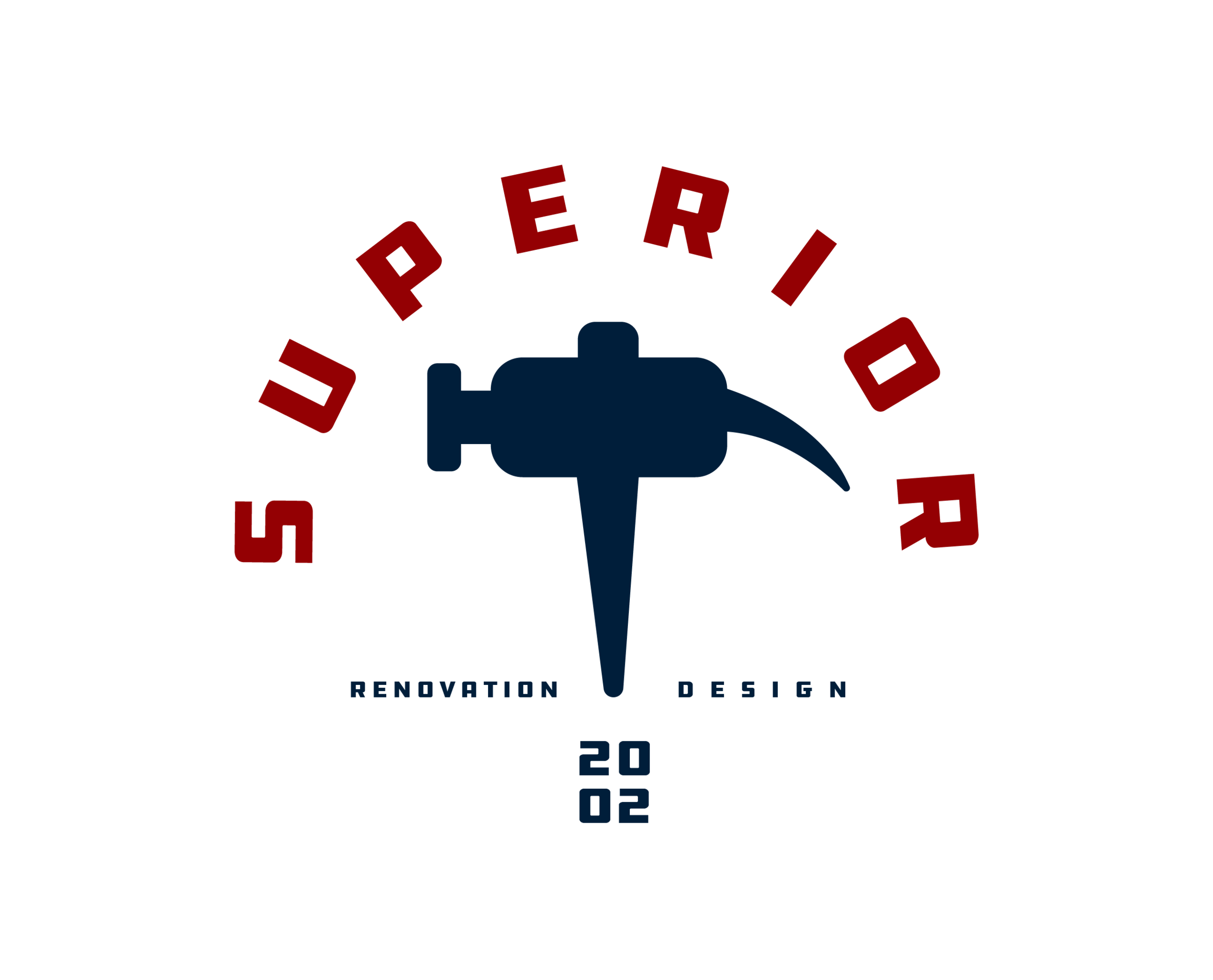
How do you make a family owned, multi decade company “of the times”? I was approached by Superior to rebrand their woodworking design studio after 15 years of business. They were afraid that with the design trends of today, the quality of the work they could do wasn’t being seen because of their brand approach. With traditional red, white, and blue colors and a 1980’s font that yelled “my uncle makes tables in the country”, they were not doing their exceptional attention to detail and gorgeous wooden interiors, a favor.
THE SOLUTION:
When rebranding an older company, you cannot simply forget everything that makes them who they are. So I kept the color palette with small refinements and really highlighted their history as a company, adding the year “2002” to their new modern logo. They had a hammer incorporated poorly into their old brand identity and really wanted me to keep that hammer in the picture. I redesigned my own interpretation of a beautiful hammer design and made it an alternate logo that they could slap on anything they wanted. While retaining the roots, Superior Renovation and Design is now a fully vibrant woodworking company with trends of the time in mind.


